


We all know what a map of the world looks like, even if there's some debate over whether it's an accurate representation of global geography, with the likes of the Gall-Peters Projection presenting differing models of map design. If you decide to weight the world in terms of specific criteria, however, we can gain some fascinating insights into social and technological dynamics on a worldwide scale.
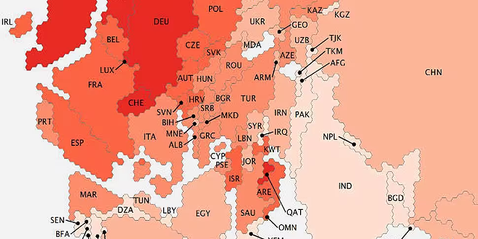
The Oxford Internet Institute is working on a series of 'Information Geographies', which 'weights' countries based on their internet access and use. As well as more general representations of the world's online connectivity, the group has produced fascinating map graphics on topics such as Wikipedia creation by country, the geographic spread of user-generated content on Google and a dynamic map of what newspapers are most popular in specific regions of America.
You can check out the full range of maps here. Some of the most interesting are posted below. There are some fascinating insights into global internet habits - Europe, for example, emerges as a dominant internet 'power', while Ireland is something of a Twitter powerhouse, given our modest size and population.


(Images: Oxford Internet Institute, Creative Commons 3.0)


