


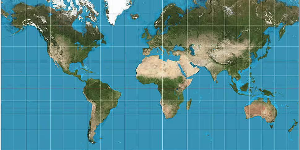
If you've ever wondered why Greenland seems impossibly large on most maps, that's because it isn't.
Given the impossibility of accurately replicating a globe on a two-dimensional surface, a variety of different map projections have been devised for different purposes.
The most common and familiar is the Mercator projection, created by a Flemish cartographer in 1569. This found favour among sailors as it proved ideal for keeping a straight course on ocean voyages, but it tends to distort the size of landmasses.
Because the scale increases towards the poles, landmasses near the top and bottom appear longer, while those near the equator are more accurately sized.
To give you an idea of just how far off the Mercator projection is, Buzzfeed has made this handy video to rectify your misconceptions.


